On July 23, 2026, Proskauer’s New Media and Technology Law Blog published a client alert rounding up three 2026 rulings that all turn on the same question: when does a website user have enough notice of hyperlinked terms to be legally bound by them? The three cases reached three different outcomes, not because courts disagree on the law, but because the underlying interfaces looked different. A small gray link buried under a big red button lost. A hyperlink placed directly beneath an action button, in contrasting blue text, won. And a single company’s app, Cleo AI, bound some users and not others depending on which version of its onboarding screen they happened to see.
The authors, Wai Choy and Una O’Brien-Taubman, frame it as a “totality of the user experience” test rather than a single bright-line rule. That is a genuinely useful, if slightly uncomfortable, message for any business running a website or app on a clickwrap-style or hybrid terms-of-use flow: the words in your terms of use matter, but so does exactly where that link sits on the page, what color it is, and what button is next to it.
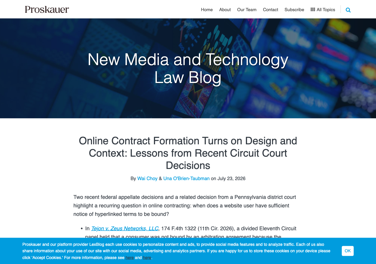
Source: Proskauer, New Media and Technology Law Blog, captured August 4, 2026.
What actually happened in each case
Tejon v. Zeus Networks, LLC, 174 F.4th 1322 (11th Cir. 2026), started as a Video Privacy Protection Act claim against the video platform Zeus. A user had subscribed on an iOS device from a “Choose your plan” screen that put two large red subscription buttons front and center, with a link to the Terms of Service sitting underneath in small gray text among other clutter about age restrictions and auto-renewal. There was no checkbox to confirm agreement. A Florida district court denied Zeus’s motion to compel arbitration, and a divided Eleventh Circuit panel affirmed, holding that the hyperlink was not conspicuous enough to put a reasonably prudent user on notice, even though the page did state that subscribing meant agreeing to the linked terms.
Dahdah v. Rocket Mortgage, LLC, 166 F.4th 556 (6th Cir. 2026), reached the opposite result on a Telephone Consumer Protection Act claim. The plaintiff had gone through a multi-screen flow on LowerMyBills.com, a mortgage referral site, clicking buttons labeled “Calculate” and “Calculate your FREE results.” Language directly below those buttons stated that clicking meant agreeing to the site’s Terms of Use, which contained an arbitration clause and were hyperlinked in contrasting blue text. A Michigan district court had declined to compel arbitration, pointing to small font and distracting page elements, but the Sixth Circuit reversed, applying California law and finding the notice reasonably conspicuous. The court called it a close question, but weighed the proximity of the notice to the action buttons, the blue hyperlink color, and the fact that the transaction anticipated an ongoing relationship rather than a one-off purchase.
Hoover v. Cleo AI, Inc., No. 23-01067 (M.D. Pa. May 29, 2026), split the difference inside a single case. Three plaintiffs had all encountered a 2019 onboarding screen that linked to Cleo’s terms but never told them what action, like clicking “Continue,” would count as agreeing to those terms. The court held that screen did not bind anyone. Two of the same plaintiffs later encountered a 2025 clickwrap screen that explicitly stated clicking “I agree” accepted the terms, including a new arbitration clause. The court found the 2025 screen did bind them, and stayed their claims pending arbitration, while the claim from the plaintiff who never saw the 2025 screen went forward in court. Cleo has since appealed that ruling, giving the Third Circuit a chance to weigh in.
The spectrum courts are actually applying
Proskauer’s alert frames this as a spectrum rather than a single test. At one end, clickwrap agreements, where a user affirmatively checks a box or clicks “I agree” after being shown the terms, are generally enforced because assent is explicit. At the other end, browsewrap agreements, where terms just sit behind a link somewhere on the site and use of the site is treated as acceptance, are harder to enforce and depend on whether the user had actual or reasonably conspicuous inquiry notice. Tejon, Dahdah, and Hoover’s 2025 screen all fall in the middle: hybrid or sign-in-wrap agreements, where continuing past a button is treated as assent, but only if the page reasonably communicated that the button click carried that meaning.
Case outcomes at a glance
| Case | Court | Notice design | Outcome |
|---|---|---|---|
| Tejon v. Zeus Networks | 11th Cir., 2026 | Small gray hyperlink beneath large red buttons, no checkbox | Not bound |
| Dahdah v. Rocket Mortgage | 6th Cir., 2026 | Blue hyperlink directly below action button, repeated on two screens | Bound |
| Hoover v. Cleo AI, 2019 screen | M.D. Pa., May 29, 2026 | Linked terms, no statement of what action meant assent | Not bound |
| Hoover v. Cleo AI, 2025 screen | M.D. Pa., May 29, 2026 | Explicit “clicking I agree accepts these terms” language | Bound |
Figure: the same underlying legal question, four different notice designs, and a two-two split on whether the user was bound. Source: Proskauer, New Media and Technology Law Blog, July 23, 2026.
What this means for your website’s terms of use
None of these rulings say hyperlinked terms are dead, and none of them require a full scrollwrap flow that forces every visitor to scroll through a wall of legal text before they can buy anything. What they consistently punish is a specific, common shortcut: a terms of use link that is visually secondary to the button it is supposed to gate, without any text that tells the user what clicking that button actually does.
Proskauer’s own practical takeaways line up closely with what a well-built terms of use page and checkout flow should already be doing. Put a clearly worded assent statement, “by clicking X, you agree to our Terms of Use,” directly next to the button the user is about to click, not buried in a footer link. Make the hyperlink itself visually distinct through size, color, or contrast rather than letting it blend into surrounding text. Test the flow on mobile, since both appellate cases here involved mobile or app-based transactions. And keep records, dated and version-controlled, of what each terms of use screen actually looked like at the time a given user went through it, since Dahdah turned partly on records showing what the plaintiff saw on each visit.
A generator cannot fix your checkout page’s layout or button placement, that is a product and design decision your team controls directly. What it can do is make sure the document itself is not the weak link: a terms of use with a clearly labeled, easy-to-find arbitration and dispute-resolution section, rather than one clause folded into a wall of boilerplate, gives your interface team something worth linking to conspicuously in the first place. Our Website Terms of Use Generator builds that document with dedicated, clearly labeled sections rather than a single dense block of text.
Bottom line
Tejon, Dahdah, and Hoover are not three inconsistent rulings, they are three courts applying the same underlying test, “was the notice reasonably conspicuous,” to three different-looking pages and getting three different answers. If your site’s terms of use link is small, gray, and sitting far from the button a user actually clicks to buy something or create an account, that is now the exact pattern courts have struck down twice at the circuit level in 2026 alone. Fixing the interface is on your team. Making sure the underlying document holds up once someone does read it is what a generator is for.
The information in this article is for informational purposes only and should not be construed as legal advice on any matter, and does not create an attorney-client relationship.

![$68.6B: Amazon Advertising 2026 [Spend Data]](/_astro/amazon-advertising-2026.DFxB0rDi_1ebTR.webp)